A professional resume layout can accomplish the goal of gaining a competitive advantage in the job market. Impressing hiring managers today is an arduous task. According to Glassdoor, each corporate job attracts nearly 250 resumes on average. Out of those 250 candidates, only 4 to 6 will be awarded an opportunity to interview. These statistics demonstrate the alarming increase in the number of job candidates applying to jobs today and the competitiveness of the hiring process.
Research has shown that recruiters and hiring managers will typically spend only 6-7 seconds looking at a simple resume before determining whether or not a job candidate should move forward to an interview. A job search website called TheLadders used eye tracking software and found that upon the initial 6-7 scan, recruiters search for criteria such as the name, current title, company, current position start and end dates, previous title and company, previous position start and end dates, and education of the job candidate.
For this specific reason, it is extremely important to make sure your content is punchy, relevant, and showcases all of your key accomplishments and experience quickly. First impressions in the job hiring process is everything. When attempting to impress a hiring manager, implement these simple resume layout tips in your writing to boost your chances of making a great first impression.
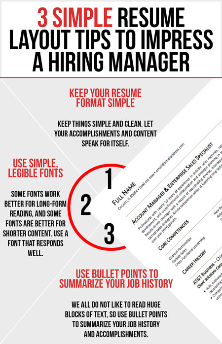
1. Use A Simple Resume Layout
There are very few recruiters and hiring managers who like to read through over-complicated text or disorganized formatting. Pertaining to the overall appeal, the ultimate goal in its creation is to keep things simple and focus on the content. Allow your accomplishments and content to speak for itself. Also, make sure you’re not using any graphics and icons, as these do not help applicant tracking systems (ATS) grab the right information from your simple work resume to put into their systems.
Creating a professional resume layout that can compete against job competitors and beat applicant tracking systems is a difficult task and requires one to be meticulous. Certified writers are experts in the field and will guarantee a layout that will perform adequately. To obtain a cost effective resume layout designed for optimal performance, contact our team or check out our professional services.
2. Use Bullet Points To Summarize Job History
The key to an extraordinary and effective resume is proper formatting of your work history and career accomplishments. Bullet points help maximize the impact of your writing by allowing hiring managers to immediately key in on your career accomplishments.
It is critically important to remember that in beating the applicant tracking system, a standard resume layout needs to be attractive and easy-to-read. Again, no recruiter or hiring manager likes to read through huge blocks of text. Therefore, you must utilize bullet points to summarize your job history and accomplishments. Finding a perfect balance to be descriptive without being overly long-winded and staying away from bullet points that are far too short can prove to be the difference maker in your job search.
In a study conducted by CareerBuilder, 25 percent of hiring managers will not even waste their time reading through a job resume that contains long paragraphs and text. As a job seeker, of that 25 percent of hiring managers, one could have potentially offered you an interview. Be sure to bold your headlines and create bulleted lists of your areas of expertise and your accomplishments.
3. Use Legible, Simple Resume Fonts
Statistics have shown that some fonts work better for long-form reading, and others work better for shorter, more punchy content. Your resume is a technical document with ideally around 400 words, so plan to use a font that is legible and not over-complicated. Depending on how much relatable content you have, use a font that responds well to the size of font you need to use.
Avoid using fonts such as Comic Sans, Lucida Console, Brush Script, and any other font that looks complicated or widely spaced out on paper. Studies show that some of the best simple fonts to use for simple and professional resume writing are Book Antiqua, Garamond, Cambria, and Calibri.
It is also a general rule of thumb to use a font size between 10-12 when writing for these two reasons; too small of a font can affect the readability of your document which in turn can create difficulty for hiring managers to look through your information. Too large of a font could be perceived as an attempt to hide a lack of content and information to share with the employer.

