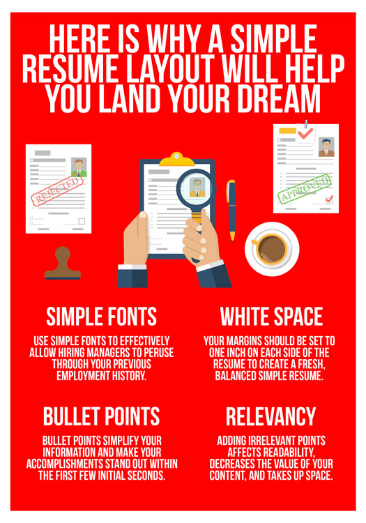
Simple Resumes can come in many shapes, forms, and formats. Before the implementation of Applicant Tracking Systems (ATS), creative resume layouts were considered intriguing and visually appealing to potential employers. Now, due to the heavy-handed use of ATS, a creative resume format would be quickly filtered out of the job pool before they even reach the eyes of hiring managers.
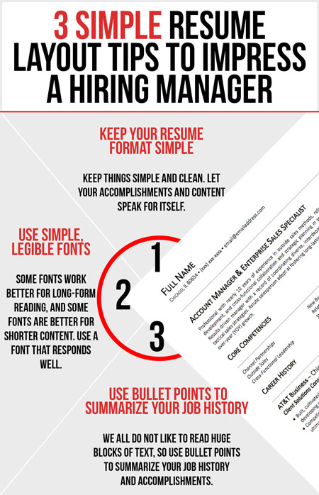
Hiring managers tend to want to see a simple and professional resume format. Features such as flashy fonts, colorful paper, and candidate headshots can potentially work against the candidate by creating bias. Due to this, it is important to keep the simple job resume layout basic while focusing on the content (download one of our simple resume examples to see how your resume should be formatted).
Simple Font
The specific font that you use to write your content can have an effect on your job search. Hiring managers and recruiters tend to scrutinize candidates heavily, and choosing to use the wrong font can prove to be detrimental. Making a great first impression is important in not only impressing the employer, but also in moving forward towards your goal of a dream interview. Certain fonts can come off as unprofessional and not display well on white paper.
There is sometimes debate on whether or not to use serif or sans serif fonts. Many may say that serif fonts should be avoided as they are not as sharp or professional looking as san serif fonts. However, either or can be chosen for your writing.
Avoid using fonts such as Comic Sans, Lucida Console, Brush Script, and any font that looks too complicated or widely spaced out on paper. Studies show that some of the best simple fonts to use for simple resumes are Book Antiqua, Garamond, Cambria, and Calibri.
It is also a general rule of thumb to use a font size between 10-12 when writing a simple resume for two reasons; too small of a font can affect readability, creating difficulty for hiring managers to look through your information, and too large of a font could be perceived as a lack of content and information to share with the employer.
White Space
There is a standard rule that is simple to follow when it comes to white spacing on your resume. Similar to bullet points, white space is a technique that increases the chances of a hiring manager being able to immediately see your accomplishments.
When creating a simple resume format, your margins should be set to one inch on each side of the document to create a fresh, balanced simple resume. This eliminates the practice of cramming too many words into white space, which can negatively affect the readability of simple resumes.
Bullet Points
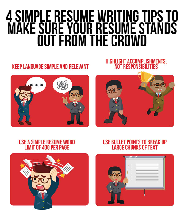
Your basic resume design should not reflect the attributes of an essay. Bullet points are critical to simplifying your information and making your accomplishments stand out within the first few initial seconds. They give you the opportunity to organize, highlight, and separate your skills, accomplishments, and job duties.
Choosing to create a bulleted list of your accomplishments within your simple resume format instead of writing in paragraph form helps to create aesthetic appeal and break up your text. This can have a positive effect on the readability of your document.
Simple resumes get interviews. Bullet points have significant importance in the writing process. Your content should not reflect the attributes of an essay in any fashion. With bullet points, you have the opportunity to organize, highlight, and separate your skills, accomplishments, and job duties.
Relevancy
One of the biggest mistakes you can make is including irrelevant work experience, which negatively impacts simple resumes in several ways. It affects readability, decreases the value of your content, and takes up space. For example, if you are applying for an accounting role, simplify your writing to only include accounting information. By doing this, hiring managers will be able to see relevant, important points about your employment history.
Simple resumes will give you a better chance of landing an interview since they are clear, concise, and consistent. Utilize this information to propel your writing to BOOST your chances of creating a layout that will land your dream interview.

